在线客服
在线客服


|
[原创]超牛Outlook导航导控件(Outlook Navigation Panel)
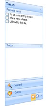
 [原创]超牛Outlook导航导控件(Outlook Navigation Panel) [原创]超牛Outlook导航导控件(Outlook Navigation Panel)![[原创]超牛Outlook导航导控件(Outlook Navigation Panel)](http://www.csframework.com/images/seo/SEO-winform%E5%BF%AB%E9%80%9F%E5%BC%80%E5%8F%91%E6%A1%86%E6%9E%B6.jpg "[原创]超牛Outlook导航导控件(Outlook Navigation Panel)") 1. IntroductionWho doesn’t know the Outlook Navigation Pane on the left side of the Outlook screen? Do you want to use the Navigation Pane in your project for free? Read on. 1.介绍 谁不知道位于Outlook主界面左侧的导航面板(Outlook Navigation Pane)? 你想不想在你的项目内使用免费的导航条控件?预知详情如何,下面详细分解! (Outlook Navigation Panel) 2. BackgroundThere is a lot of junk on the .NET market. Small study room projects being sold as large toolkits providing a bunch of crappy controls for a lot of money. To extend my portfolio and to give the open source community something back, I decided to make this control available free of charge. This control is also a note to control vendors, take your customers serious and provide valuable controls and support for their money. So enough preaching, let’s get cracking. 2.背景 .NET市场有很多不入流的垃圾作品, 一些小的工作室为了赚钱开发的工具包提供大量没啥价值的控件. 为了扩充我的原创作品并给予开源社区一些有价值的资料,我决定把这个控件免费提供给大家。 同时提醒某些控件供应商需要严格审查你们的客户, 要求他们提供一些有价值的控件. 否则骗了你的钱还云里雾里不知情! 好了,不讲这些大道理了,我们转入正题 Windows Form, the King is Dead??I decided to create this control for Windows Forms to show the potential of Windows Forms. Windows Forms is not dead, because it performs betters and is responsive. WPF has a way to go. Besides that, you need a designer to design your controls, otherwise you’ll end up with a Christmas tree. Windows窗体,王者已死吗? 我决定编写这个控件用来证明Windows窗体的潜力, Windows Forms没有死,他性能优异且响应快速,但是WPF有很长的路要走。 除此之外,你需要一个专业的设计师来设计控件,否则你就像圣诞树一样老气横秋. 3. Structure of the Navigation PaneIn this section, I’ll briefly explain the basic objects of the Navigation Pane. 3.导航面板结构 在本节中简单介绍导航面板控件的基本对象。先看下图
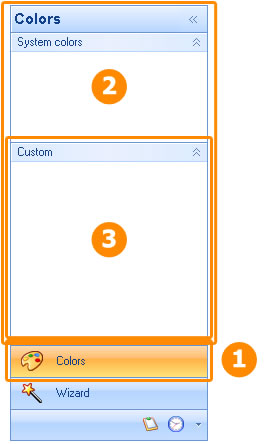
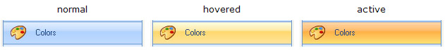
The Navigation Pane consist of bands, buttons and groups. The bands (2) are the basic object the Pane exists of. Each band is one to one linked to a button (1). The band is the container that comes to the front when the user clicks on one of the buttons. The band contains the other controls like the group (3). The bands can be expanded with groups which can be compared to the groups in Outlook. The Group is a control container which can be collapsed and expanded. 导航面板由区间(Bands),按钮(Button)及按钮分组(Group)组成。该区间(2)是面板控件(Panel)中的基本对象。 每个区间一对一对应一个按钮(1)。 按钮区实际上是一个容器(Container), 当用户点击导航面板中的一个按钮时会把这个容量显示有最前面。Band包括另一个控件如分组(3). 在Outlook中该区间(Bands)可以扩展显示当前按钮分组(Group)里的内容。 按钮分组是一个可以自由升缩的控件容器。 Button/BandA button has three states, normal, when it’s hovered by the mouse and when it’s the active button or when the button is down. 按钮/区间 按钮有3种状态,正常,鼠标移动,活动状态
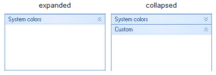
GroupA group have two states, either it’s expanded and all child controls are visible or it’s collapsed and only the header is visible.
组 组有两种状态,1.当组扩展后显示所组内所有的子控件。 2。当组收缩后仅显示组的标题。
4. LayoutThe main class of the control ( 4.布局(版面设计) 控件主类(NaviBar)至少容纳两个包含按钮和Bands的集合. 布局类是相当重要的类。主类最主要的工作是决定布局处理何时调用。 这是布局引擎的原则。更深入地解释请参考MSDN的文章 The layout process decides what control should be visible, active and at what position, etc. The advantage of this principle is that it’s really easy to implement a different layout without too much hassle, because the main control only knows that there is an layout but what it exactly does, he doesn’t care either. As long as it looks nice, like the toolbox in Visual Studio or like the Navigation pane in Outlook, or some other fancy view. Renderers and ColortableSeparate classes are responsible for drawing the controls. The main class delegates like a lazy manager. The renderers are only responsible for drawing the objects, the colours are coming from separate classes, the colortables. If you are in a good mood, you can use flashy bright colors with a few lines of coding: 控件着色及颜色表 系统设计应该分而治之,分离出来的类各尽其职,主类就像一个懒惰的经理代表, 渲染器仅仅负责绘制对象,颜色是由类颜色表(Colortables)指定的。如果你心情好,你可以使用下面这行代码给控件设置华丽明亮的颜色:
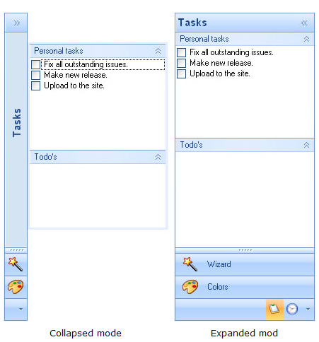
NaviButtonRenderer.ColorTable = FlashyColorTable; This elegant principle is ripped away from the default .NET menus which are coming with Visual Studio. 5. FeaturesHere is a brief list of the features. To see the whole package, see the demo project. CollapseIt’s possible to present the Navigation Pane in compact mode. Click on one of the small buttons on the top right of the header of the control. You can also collapse the Navigation Pane by setting the 收缩功能 点击控件头部右上角小图标可以隐藏或显示控件,或者设置NaviBar.Collapsed属性为true.
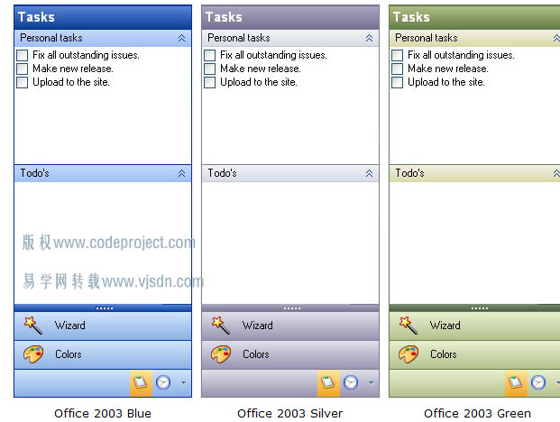
LayoutstylesThe Navigation Pane comes in six different flavors. Office 2007 is the main layout and for those who are stuck in the past, there is the Office 2003 look and feel. If you want to create a new colourstyle, you need to make an override of the 布局样式 该导航条控件有6种不同风格的样式, 下图是Office 2003的外观样式. 如果你想创建一个新的颜色外观只要重写NaviColorTable类即可。 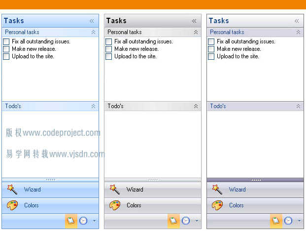
 Right to LeftThis Navigation Pane is among the few who do support Right to left layout. Not much work when the layout has been defined in separate classes. It’s possible that not all features are like they should be. If one of the Arabics would like to test it and make me happy with the results? Saving Settings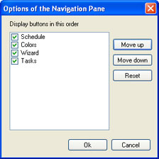 It’s possible for the end user to customize the layout. Like the ordering of the buttons or the visibility of the buttons. It’s possible to save the layout settings in an external data file. The details which are saved are the ordering of the buttons, the visibility of the buttons, the amount of visible buttons, the position of the splitter and whether the Pane is collapsed or not. The settings are stored in the 控件设计存储在NaviBar类的Settins属性. 可以将设置保存在本地文件内, 添加引用Guifreaks.NavigationBar.XmlSerializers.dll 然后使用下面的代码: if (saveFileDialogSettings.ShowDialog() == DialogResult.OK) { try { string fileName = saveFileDialogSettings.FileName; NaviBarSettingsSerializer serial = new NaviBarSettingsSerializer(); using (TextWriter w = new StreamWriter(fileName)) { serial.Serialize(w, naviBar1.Settings); } } catch (Exception ex) { MessageBox.Show(ex.Message); } } You can use the same DLL to load the settings. After loading the settings, use the ApplySettings method in the NaviBar class to activate the settings. if (openFileDialogSettings.ShowDialog() == DialogResult.OK) { try { string fileName = openFileDialogSettings.FileName; NaviBarSettingsSerializer serial = new NaviBarSettingsSerializer(); using (StreamReader reader = new StreamReader(fileName)) { NaviBarSettings settings = serial.Deserialize(reader) as NaviBarSettings; if (settings != null) { naviBar1.Settings = settings; naviBar1.ApplySettings(); } } } catch (Exception ex) { MessageBox.Show(ex.Message); } } 6. SamplesHere are a few basic code samples that should get you up running fast. How to Add a New Group?While you are into the designer, you can select the group from the toolbox and drag it into the band. Here is a code sample when you want to add a group from the source: NaviGroup group = new NaviGroup();
group.Text = "test"; group.Expanded = true; group.Dock = DockStyle.Top; naviBand3.Controls.Add(group); How to Add a New Band?You can add a new band to the Navigation Pane using the NaviBand band = new NaviBand();
band.Text = "NaviBand" + (naviBar1.Bands.Count + 1).ToString(); band.SmallImage = Properties.Resources.bookmark1; band.LargeImage = Properties.Resources.bookmark; naviBar1.Bands.Add(band); How to Set the Layout?The layout can be set using the naviBar1.LayoutStyle = NaviLayoutStyle.Office2003Silver; How to Activate a Band?Making a particular band the active band is fairly simple: naviBar1.ActiveBand = naviBar1.Bands[0]; 原文: http://www.codeproject.com/KB/menus/NaviPane.aspx 本文来源:  扫一扫加作者微信  
参考文档:
[原创]递归读取DataTable加载TreeList控件 控件与组件的区别(Control&Component的区别) Winform 快速初始化Dev TreeList树控件的数据 LookUpEdit控件带给用户良好的操作体验 ucWindowTitle用户控件 - 用户界面规范控件 [原创]C#一键隐藏QQ/MSN,显示/隐藏系统托盘图标,获取托盘图标 使用Scheduler控件实现生产进度监控程序 C# GridView列头添加CheckBox控件实现全选功能 C#实现DevExpress控件换肤功能 C#开发自定义控件-设置显示工具箱中的图标 C# 实现完整功能的截图控件(1)-实现绘图工具栏控件 分享2个日期选择控件 datePicker (C#)RichTextBox控件查找文本演示(功能全) C#在PictureBox控件上绘制透明背景文字. 原创Winform布局开源框架,Winform控件框架,插件化框架|C/S框架网
其它资料:
什么是C/S结构? | C/S框架核心组成部分 | C/S框架-WebService部署图 | C/S框架-权限管理 | C/S结构系统框架 - 5.1旗舰版介绍 | C/S结构系统框架 - 功能介绍 | C/S结构系统框架 - 产品列表 | C/S结构系统框架 - 应用展示(图) | 三层体系架构详解 | C/S架构轻量级快速开发框架 | C/S框架网客户案例 | WebApi快速开发框架 | C/S框架代码生成器 | 用户授权注册软件系统 | 版本自动升级软件 | 数据库底层应用框架 | CSFramework.CMS内容管理系统 | |
 旗舰版V5.1 (作者推荐)  轻量框架V2.1 (2021 release) 
|
在线客服